
Design That Cleans Up: Reimagining Scentiva for the Modern Consumer
Clorox Scentiva Packaging Redesign & Relaunch
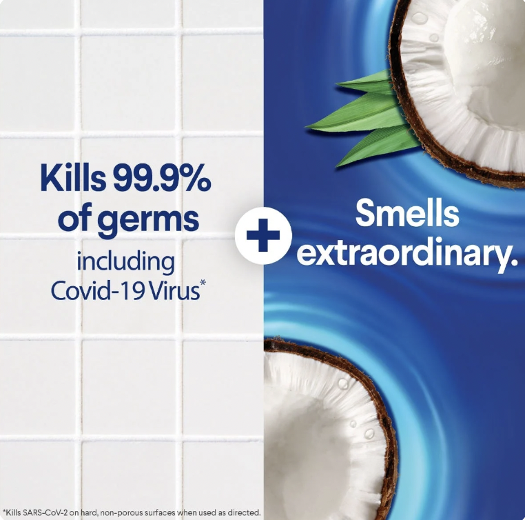
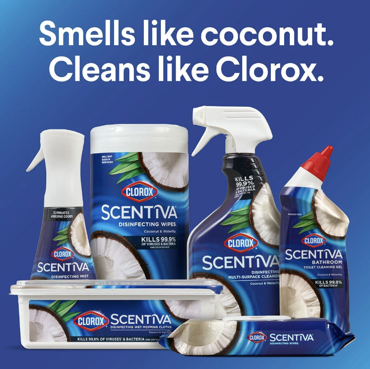
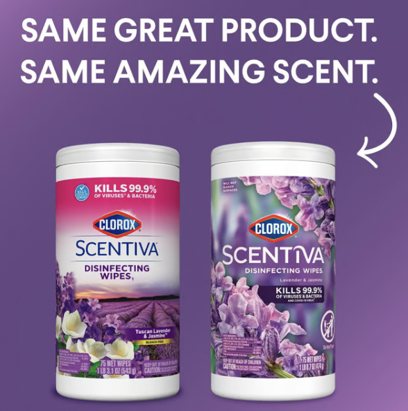
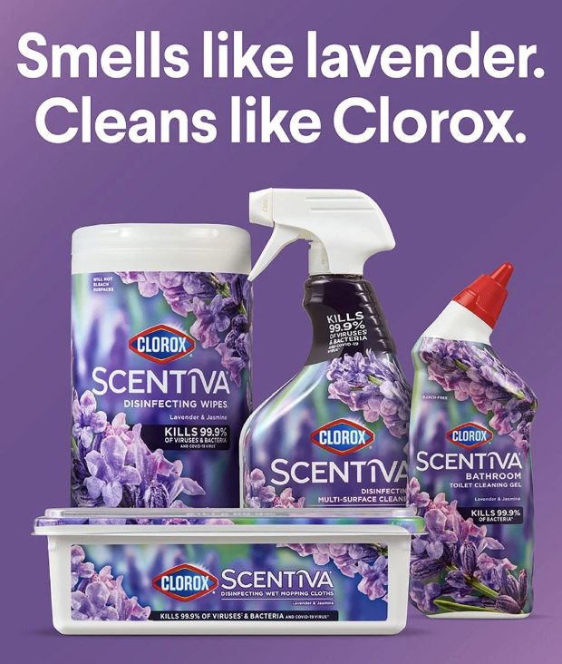
Led the end-to-end strategy and execution of Clorox Scentiva’s packaging relaunch, shifting the brand from its original “destination-inspired” design to a modern, standout look that better aligned with consumer preferences and competitive whitespace. Rooted in the insight that the cleaning aisle is saturated with clinical white packaging, the redesign aimed to visually disrupt the category and position Scentiva as a more elevated, design-forward option. I developed a new naming and packaging architecture across all SKUs to improve navigation, consistency, and shelf impact — while also managing cross-functional alignment, creative development, and regulatory compliance within the highly complex disinfecting wipes category.
Results:
Developed and launched a new packaging system and naming architecture
Delivered a more premium and differentiated shelf presence
Navigated stringent regulatory and legal guardrails for EPA-registered claims
Strengthened the brand’s position as the style-forward option in cleaning.
This relaunch gave Scentiva a bold new identity — turning heads in the aisle while still passing the toughest tests in the category.